This started out as a short post intending to finish with a labored analogy against the recent Heartbleed SSL bug. The point was going to be that if i gave you the keys to the kingdom you would still be hopeless because the only way you get better at this is by sitting in the trenches for years. I decided that was a quite ridiculous analogy to make so instead just ramble on about the history and technicalities of skateboard photography. Enjoy!
Something occurred to me the other week1 when i received an update in my RSS reader from one of the many sources tagged as skateboarding. This was a post from greyskatemag, which had a few photos from Sam Ashley. Now what went through my mind when i saw the post is probably quite different to what went through your mind when/if you looked at the post, and there is a clear reason for that.
I haven’t shot a skate photo in over a year. I haven’t shot a skate photo i was happy with in over two years. And i haven’t had a skate photo published in a skateboarding magazine for over three years. But i spent about a decade shooting skate photos so i still think about it a lot and often find myself visiting skate photo sites and buying skateboarding magazines whenever i come across them (my subscriptions have long since expired).
Because of that time spent what went through my mind when the post loaded in my RSS feed reader, without having read any of the included text, was as follows:
- Sam Ashley?
- Backside ollie
- Frontside ollie… Where is that?
- Definitely Sam Ashley, Sheffield, wasn’t that a Sidewalk cover?
- Barnsley football ground
- Leeds Uni Banks, that’s fricking ridiculous!
- Switch, Manchester?
So what occurred to me was how i see skate photos has been irrevocably shaped by my time spent shooting skate photos. In that time i shot many skate photos, a couple of hundred at least; this may not seem a lot but this was all film, not digital. I was also buying an awful lot of skate magazines and thus spent much time absorbing, in a visual sense, tens of thousands of skate photos2. So there came a point in time when i started to see skate photos differently, almost as if i was seeing through the image.
What happens at that point is that you begin to see not the things that make the pictures great, but the things that make the pictures different. You recognise a photographer’s tells, like the absolutely perfect verticals in every Sam Ashley photo; or the post processing or lighting style that give away the photographer. You know the spots (locations), or don’t as the case may be; you wonder why you didn’t think to shoot the spot from that particular angle, or are amazed that a skater could come up with a particular line/trick leading to a whole new way to shoot the spot. You know that a shot from a location in London is more likely to be by one particular photographer and a shot from Scotland is more likely to be by another particular photographer. The same applies for specific skaters and skate companies. You can name the tricks without even having to think twice, because you know the specific timing for each trick, and you can tell from the way a skater’s body is positioned whether the trick is switch/fakie/nollie/and so on.
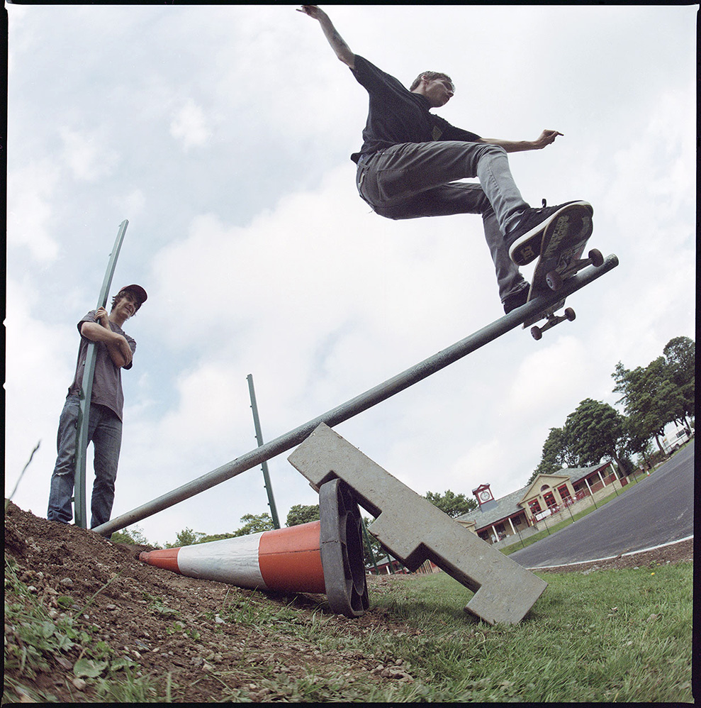
Some of that knowledge no longer applies. I was shooting when the use of medium format film was still common, the vast majority of skate photos are now shot using 35mm digital and that introduces a huge number of variables that result in differences in the final image. The result is that i now have trouble identifying the photographer without looking at the caption.
Technicalities
Let’s talk about this because it’s practically impossible to talk about photography without it, at least to a point, and we should get it over and done with early. It’s especially important in skateboard photography and we can see four clear epochs in the way skateboard photography has evolved when it comes to the key equipment.
In the early days of skateboarding and skateboard photography, sometime in the 1970s, everything was basic; The tricks, the gear, the photography. The first epoch was the use of the fisheye lens, by Warren Bolster et al, and allowed for even the most basic tricks to look amazing. With a fisheye lens you are able to get so close to the action that it’s impossible to get a photo that doesn’t feel absorbing. That’s if you’re using it correctly of course, take a couple of steps back and the effect is gone; i was always of the opinion that if you were shooting with a fisheye lens and you didn’t feel there was a good chance of being hit then you weren’t close enough. Yes i got hit, more than once.
The second epoch is harder to pinpoint because it involves off camera lighting, and it’s clear from many skate photos that this was happening to an extent early on. We see it in photos from the 1980s, with the use of daytime fill flash to correctly expose skaters and freeze action as well as getting the 3d like “pop” effect in images. Skate photographers were increasingly using colour positive film, which was a swine to expose correctly and had shallow dynamic range meaning shadows were a problem; using off camera fill flash fixed these issues.
We can make this epoch clearer by looking at the work of Wig Worland, who took off camera lighting to its extremes by essentially imagining the street as a studio. Wig’s lighting was often so good, or so subtle, that you could look at a photo and think it was shot without the use of off camera lighting when in fact the lighting was essential. This was happening in the mid 1990s and really took hold with the next epoch, detailed below. The thing about lighting is that it is very difficult to do well, and for many skate photographers it becomes a crutch. I was never that good with off camera lighting, and my photos improved significantly when i abandoned my flashes, radio controls, and light stands.
The third epoch is the arrival of medium format sometime in the early 2000s. Atiba Jefferson is often credited with this, but the previous epoch has probably more to do with it - if you’re shooting a trick as if you were in the studio, spending a lot of time organising off camera lighting and such, why wouldn’t you use a Medium Format camera? Those expensive and often cumbersome cameras suddenly didn’t seem that slow or expensive. The two key factors in the uptake of Medium Format can be summarised quite easily. 1) the higher flash sync made shots sharper and daytime use of flashes easier, and 2) The fisheye lens.
Skateboard photographers, with few exceptions, love their fisheye lenses; and the Hasselblad fisheye lens was a stunning piece of equipment. Corner to corner tack sharpness, with 1/500 flash sync, with a Medium Format sized negative allowing you to use depth of field with that fisheye. And you could check your lighting with a polaroid back! And the square format, it just suited skateboard photography and magazine layout so well. Soon it was everywhere, every skateboard photographer was shooting with a Medium Format camera and sticking $10,000s worth of camera gear in front of flying pieces of metal and wood. Crazy.
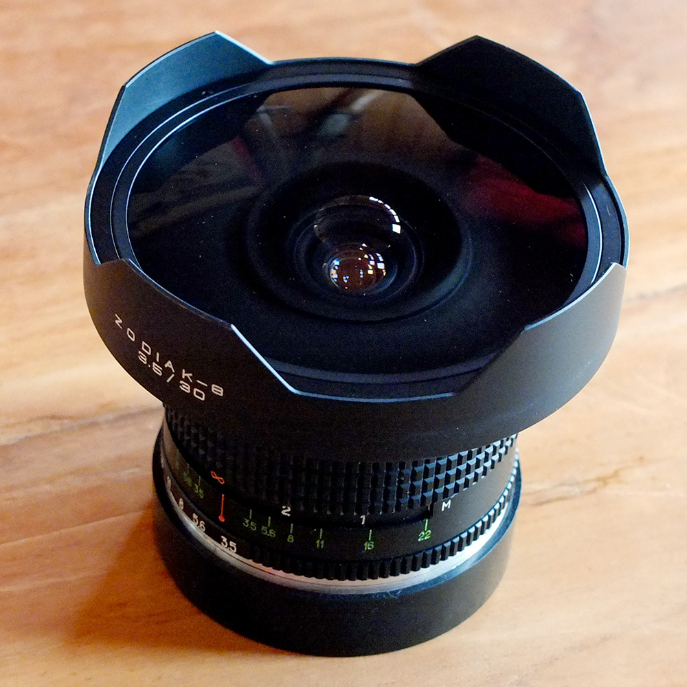
Medium Format usage didn’t last long however. At a push you could say a decade, but that would be a real push. There are still some photographers holding on: last time i checked Oliver Barton was still using a Hasselblad and putting it to good use with the knowledge he gained from Wig. Allen Ying, founder of 43 magazine, is an advocate for film and the pages of his magazine are a majority Medium Format photography. But for the rest of the working skateboard photographers the most recent epoch allowed them to sell their Medium Format cameras whilst they were still worth something.
Digital photography arrived not long after the start of Medium Format uptake, but it took several years before its use became widespread. I’m not sure what the real reason is here, certainly some photographers were using digital very early, but for most the use of it for stills photography didn’t really mature until around the late 00s. Maybe those photographers were still attached to their Medium Format cameras? Digital camera technology in the early to mid 00s didn’t come close. A tiny digital sensor compared to a 6x6 chrome shot at 1/500 flash sync? No contest. Digital cameras were relegated to shooting sequences, and skateboard photographers felt as though they were doing a filmer’s job. All for the sake of a sequence where the individual frames weren’t much larger than a postage stamp. This was not real skateboard photography.
What shifted the balance in digital photography’s favour was the inevitable advance of technology and the release of cameras with larger sensors. Earlier digital cameras lacked the resolution, depth, and often flash sync. But they caught up and have surpassed Medium Format on most measurements. Some film shooters will argue this isn’t the case, but they’re missing the point - i’m talking about skateboard photography here. We can reduce the essentials of equipment choice in skateboard photography down to the three Fs: Fisheye, Flash-Sync, Full-Frame. The rest of the concerns will follow and will always catch up, and yes surpass, as sensor technology improves.
And it wasn’t just sensor technology that improved, digital cameras ushered in whole range of benefits. First off consider the immediate feedback - lighting suddenly got a whole lot better and the uncertainty about whether or not you had timed the capture of trick correctly was removed. Flash sync speeds above 1/250 were now possible in a 35mm frame, for some SLR models these were 1/500 and faster. And because enough is never enough technology was released to push flash sync beyond what was set by the camera controls3.
A Quick Game
Here are a few crops from some well known skate photos. For 1 point name the skater. For 2 points name the trick. For 5 name the photographer. And for ultra skate-photo-geek points (10 points) name the year.
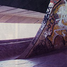
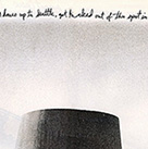
Whilst this seems like a contrived game there is a point to it - history. It applies not just to the well known photos but the day to day editorial and advert content that run in skateboard magazines. If you’re shooting a photo with the aim to have it run, i.e. get paid, you better know the history of photographic coverage of the spot, lest you shoot the same trick from the same angle. That’s not going to be a usable photo, at least not in the country were the original photo was used. Maybe as time passes and memories fade you can get away with this.
There is a limited pool of spots within skateboarding, old ones are “skate-stopped” or demolished and new ones appear now and then wherever construction takes place, but there will always a set of more well known “classic” spots. Think about it for a moment - how many photos have been published over the years from Southbank, or Lloyds (Bristol), or the Leeds University banks. How many of those photos feature the same trick shot from the same angle? It happens, but years pass between those photos.
This is one of the reasons why, in general, photos shot at skateparks are rarely used for editorial content in skateboard magazines. Of course if the subject is a vert skater or the article is related to a skatepark (comp/jam/opening) then park photos will be used. However for the most part skatepark photos are a big no-no. Why? Spots! I’ve always been of the opinion that skateboard photography isn’t primarily about the tricks, it’s about the spots. The most commonly asked question about a photo is not “who is that?” or “what trick is that?”, but rather “where is that?”.
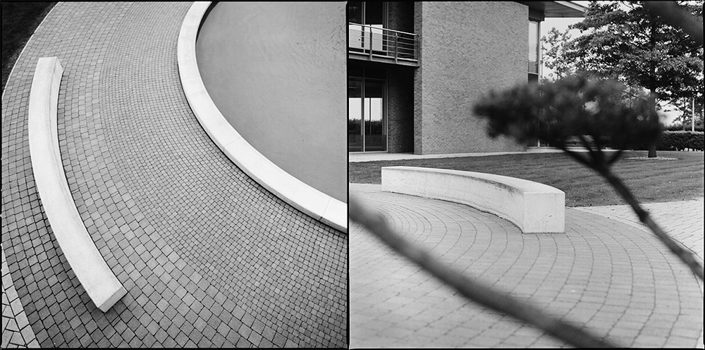
Skateboarders love to see new spots. They will travel hundreds of kilometers to skate them, ignoring the skatepark that is a five minute drive down the road. Skateboard companies frequently organise trips to the other side of the world where their skaters can hunt down and skate previously unknown spots. Once knowledge of these spots is in the skateboarding domain other companies will travel to the same locations to skate those spots. This happened in Barcelona but took several years for the knowledge to propagate. With the ubiquity of the web and cheap flights this is now much quicker - witness the explosion of coverage from places like China.
Patrick Wallner has released a serious of excellent skate videos where the primary purpose is to show trips in lesser known countries for skateboarding, often with very interesting looking spots. Those kind of previously unseen spots will always trump even the most technical/difficult/crazy trick at a known spot on pure photographic terms. It’s the equivalent of an “exclusive” from an editorial point of view. Entire articles in magazines are based on them.
Tropes / Clichés
Just to emphasise the importance of spots in skateboard photography there are specific tropes that are used to do this very thing. The largest offender is maybe the majestic pivot fakie landscape photo. How else do we sneak a nice landscape photo into a skate magazine other than by de-emphasising the actual trick? “Look at this wonderful view. Oh yeah, there’s a skater doing a trick too”. You can replace the pivot fakie with any other trick, it doesn’t matter as it’s an afterthought to the actual image we want: Aesthetically pleasing landscape image something-something-skateboard trick.
The other extreme is the fisheye at the bottom of the stairs shot, which removes all aesthetically pleasing aspects and just goes straight for the easiest way to exaggerate the size of the spot, and by association the difficulty of the trick - a fisheye lens can make a flight of stairs look like a mountain and remove all background distractions in the process. There is an argument here that surely these are examples of skateboard photography being about the tricks, and not the spots, but if that were the case then we would not be using a device that tells half truths about the trick and boosts the potential of the spot.
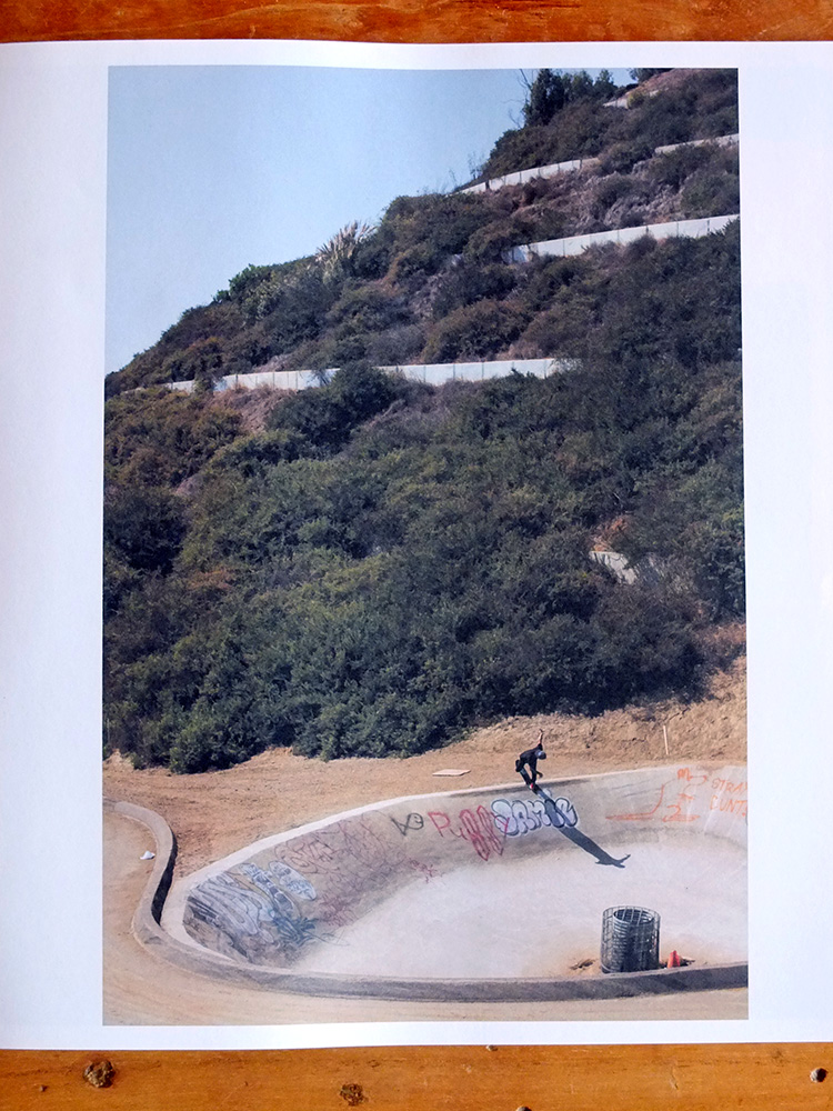
And it goes on, a relatively recent trope has been the use of tilt/shift in 35mm digital skateboard photography. The majority of this falls into the “wonderful view” category but is odd in that the tilt is used to blur out significant sections of the view and emphasise the skater. But the skater is so small as to make this effort seem contradictory. Here’s a nice landscape, oh wait don’t look at that look at the skater, oh wait they’re an almost insignificant section of the image. Is this photo about the trick or the spot? The spot. Always the spot.
Patterns
Of course skateboard photography uses the well known compositional patterns: leading lines, thirds, frames, diagonals, foreground interest, and so on. However there are a few extra rules that are absolutely essential, which can limit the compositional options for a skate photo. It is very very hard to make a successful skate photo that doesn’t follow these rules as you break the key point of the photo (the spot, right, you know this by now?).
First rule: Always make it clear where the skater has come from and where they are going. In other words show the “run up” and the “landing” points of the spot. You don’t need to show much, just enough to make it clear where these are. So with steps you never cut of above the bottom step and make sure the top of the steps are seen. With a rail you do not cut off either the start or the end, even if the skater did not use the entire rail. With a ramp you show its base even when the skater is up in the air.
Second rule: make it clear which direction the skater is moving through the frame. That is to say, don’t place the skater at the far right of the frame if they are moving from left to right, or at the bottom of the frame if they are moving top to bottom.
Third rule: get the timing right for the trick. This is hard to describe. Just about every trick in skateboarding has a fingerprint when it comes to identifying it from a single image. This ignores the more technical tricks and combinations that get shot as sequences (that we have already dismissed as not real skateboard photography). There can be some ambiguity, and complexity, in which case you time the photo to look “correct” and not seem to contradict the caption. This rule is so critical that a frame with better timing where the trick wasn’t landed is often favoured over the “make” frame.
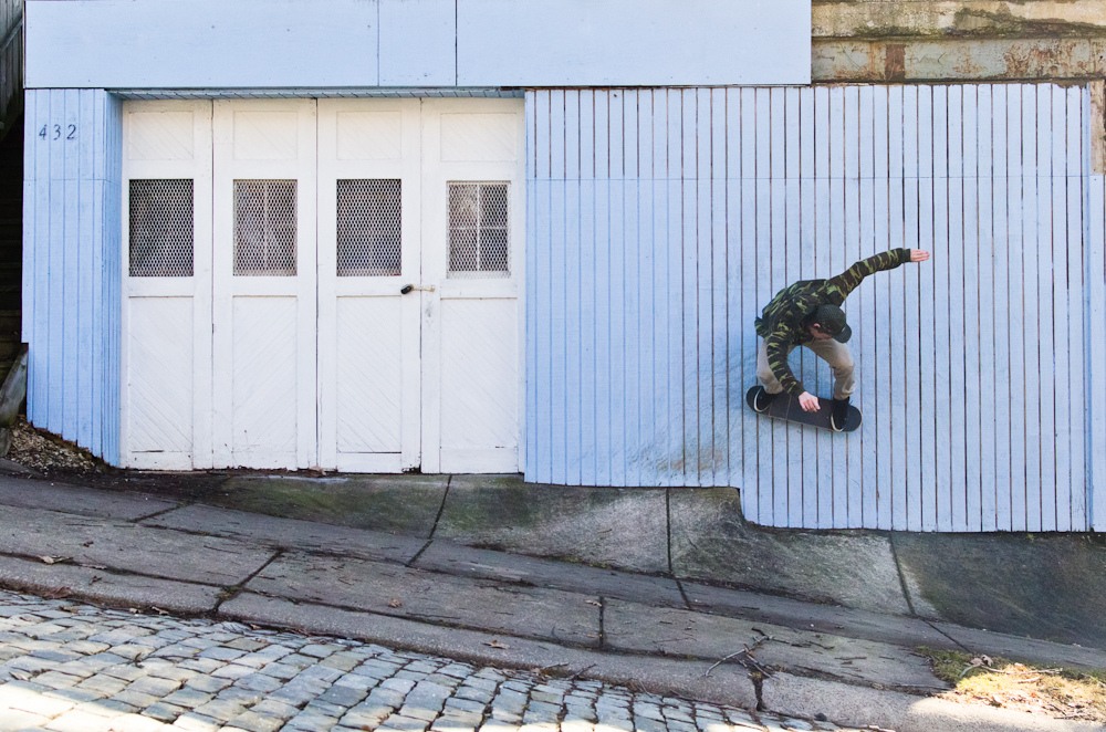
Fourth rule: show the skateboarder’s front, not their behind. This is not as hard a rule as the others, and is occasionally broken, but in general you will rarely see skate photos that show the skater from behind - a good composition may be sacrificed to favour a skater’s front being in view, or even different tricks will be done by the skater that mean the better composition can be used.
Fifth rule: don’t crop out parts of the skater - that is to say: make sure all of the skater is contained within the frame. Like the fourth rule this is occasionally broken, but never purposefully4. What happens here, most of the time, is the photographer has their composition set and then they squeeze the skater into the image. Since it’s hard to predict precisely where the skater is going to be, or the skater may throw their arms about, it can result in heads or limbs being out of the frame.
Cropped subjects used to happen in the days of film, but i don’t recall ever seeing a published image from a digital camera with cropped limbs. You might be surprised that this ever happened at all, but the way skate photographers shoot is to compose, pre-focus, and then fire the shutter when the skater is at the right place in the frame at the right time to complete the image.
Sixth rule: avoid “lurkers” - any person being in the frame that is not the skateboarder. Flick through the pages of a skateboard mag and you’d think that we live in some sort of post-apocalyptic world where human beings spend all their time throwing themselves down stairs or at rails never to step off a board. This is a rule that is sometimes broken, and another relatively recent trope has been to create “foreground interest” by having another human in the frame.
Anti-Patterns
So given the “dos” what about the “do nots”? There are a few, which generally fall into the opposite camps of the above rules, but it is possible to break these. Some skate photographers can pull it off very well, Daniel Harold Sturt for example; but for most of us these just don’t work, or they don’t work for anything but the odd photo here and there, the conventions are so well established that anything outside the norm is hard to execute successfully.
Using rectilinear wide angle lenses, in other words wide angle lenses that aren’t a fisheye, is the first don’t. The reason is simple, the fisheye has become so common in skateboard photography that any other type of wide angle looks wrong. There’s also the point that fisheye lenses are designed to exaggerate perspective, whereas a rectilinear wide angle is designed to make the scene look true to reality. Shoot from the bottom of a set of stairs with a corrected 15mm lens and you are going to get a very odd looking photo. This breaks a rule i didn’t mention above: make the trick look good, as much as possible.
Next up “guy in the sky” type shots, demonstrated by anyone that doesn’t have the first clue about skateboarding or skateboard photography. These type of shots can often be found in articles that are clearly shot by newspaper/magazine/stock photographers sent to cover some local skateboarding event and who look to get an “extreme” or “gnarly” photo. These break the first two rules, and usually the third.
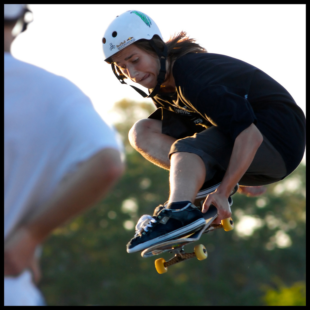
Falling into another category are badly timed photos, obviously breaking the third rule. I mentioned the fingerprint of a trick above, but what i haven’t mentioned so far is that every successful skateboard photographer is first and foremost something else: a skateboarder. This is where the intuition for trick timing comes from, the type of knowledge that can only be learnt by doing what you document. You might not be that good a skateboarder, but you have the feeling and intuition that only comes from doing. In fact, many photos by none skateboarders fall into a common trap: they show a trick that clearly wasn’t landed. You will never get away with a skate photo that looks as though it wasn’t landed unless your audience doesn’t know skateboarding.
So What Does This All Mean?
Even having told you the above i can guarantee that you wouldn’t be able shoot a decent skateboard photo without putting in significant time. You could be one of the top photographers in the world, have absolute command over your equipment and years of experience behind you, but when it comes to shooting a skateboard photo your results would almost certainly suck.
To give some examples just take a look at the top skateboarding action shots on Flickr: they suck. The same goes for 500px, they suck too. Hardly a good argument given that many of these show poor understanding of even fundamental photography skills. So take some examples by photographers who do have that understanding - any shot in the mainstream, be it a stock photo or something in the news, shot by professionals - they suck.
Even adverts that feature skateboarding, but not aimed at skateboarders, with big budgets and big names suck. And to be especially brutal, even photographers i have a huge amount of respect for, who can shoot incredible work, will always suck5 when it comes to skateboard photography because they’re not skateboarders or haven’t spent the time it takes to not suck at skateboard photography.
Another key part of the process is editing. For every photo that runs in print there are ten that don’t, and this is not because they’re not good enough. Editing is just as important as the ability to get the results, holding back is a critical. Some of the editing process also goes back to what i talked about above in relation to spots. If a heavy session goes down at a good spot then the photographer is likely to get many usable photos. How many will they use? Just one, two tops. Because, again, spots! Watching skate videos can be interesting for this reason as you (usually) see the photos before the video, and when you do see the video it is clear that many more tricks happened at the spot than were ever published in photographic form.
The skateboarding photos on this site account for less than 15% of the photos i shot, and many that aren’t on here ran in magazines. I don’t include them because i don’t think they’re that great. Maybe i did at the time, but as i got better i started to see the mistakes6. It’s that old principle of being able to look back and see how bad you were, it means you’re improving.
The only way you get better at this is by actively doing it, for a long time. You have to lie at the bottom of stairs, sometimes in what smells like piss, with flying planks of wood aimed in your direction. And you have to love that to keep doing it.
Not The Labored Analogy
Something has made it easier to get better, quicker, and this applies to many things: The Web. Previously it was difficult to find your way with skateboard photography, Oliver Barton alluded to it in the above interview; a process of trial and error and if you were lucky then you could get feedback from those who had already been through the mill. I still remember some advice Leo Sharp gave me many years ago: “Use Provia 100 but rate it at 125. Set your flashes at half power and your lens aperture at 5.6. Ask the lab to push the film one stop in development.” That’s not the kind of thing you stumble upon yourself.
In 2003 Bastian Ehl launched skateboardphotography.com. Within three years it was dead. However in its short life it was responsible for a huge spread of knowledge, brutally honest critique by the user base, and frequent submissions or feedback by photographers who would go on to be staff at major skateboarding magazines.
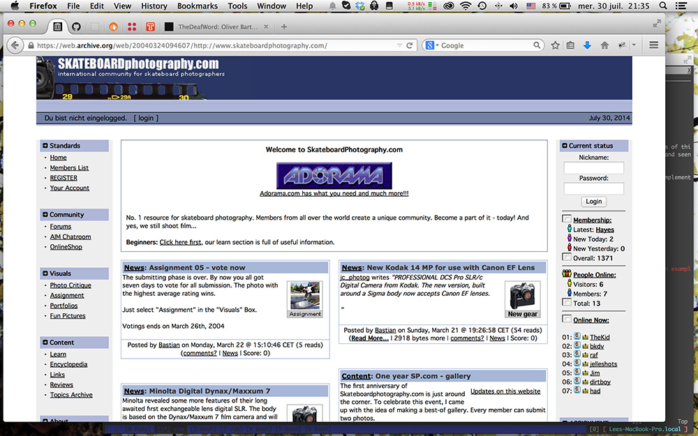
Although it has never really been replaced, at a community level that is, SBP.com was responsible for opening the floodgates. In its wake several more sites emerged. skateperception, a site for skate videographers, saw a swing towards photography. wheelsandwax tried to fill some gaps, eventually turning into ascartel.com. I don’t link to either because they’re both now dead. agroism.com was an attempt by a former SBP member to get the community back together, it failed. The last remaining holdouts are skateperception and jazzpush.com, the latter is practically on life support due to so little traffic.
Even though the resources have dwindled, they played a part in spreading knowledge and helping many newbies onto the ladder - including myself. If you search for tips on skateboard photography you are likely to find a lot of bad advice, and asking on general photography sites is no good because the photographers there don’t know skateboard photography (or worse they think they know skateboard photography). However it’s easy to get in touch with a working skateboard photographer these days, they’re pretty much all on twitter/facebook/instagram/whatever.
The Future of Open Sou^W^W Skateboard Photography
So the rise of the web and the spread of knowledge saw a lot of new photographers appear on the scene. Some of the photographers who took their first steps on SBP are still working in the business, some are staff photographers for major magazines, or senior photographers, or contributors. Or they gave it up to work on other types of photography.
You would think this new pool of photographers would benefit the magazines, and clearly it did some, but it also came at a detriment to others. The same platform, the web, would lead to the closure of some magazines due to dwindling sales. SLAP magazine, Skateboarder magazine, Document magazine7. Three big casualties.
The argument is that content hasn’t gone but rather moved onto the web, and this is true, but that content continues to evolve. Demand for video is at an all time high and this is reflected in the fact that we see far more short clips, promos, teasers, instagram shorts, etc, etc, etc, than we ever did. There isn’t a day that goes by where i don’t see at least one skateboarding clip in my RSS reader, even though i subscribe to relatively few skateboarding feeds.
But demand for high quality stills skateboard photography persists, and this is for all the reasons i have covered above. It’s very hard to do it, and do it well, and do it for a long time, and make a living from it. Most skateboard photographers burnout after a few years behind the lens. The staff and senior photographers working for magazines, or the successful freelancers, have been doing it for a long time.
And we know there is demand for printed stills skateboard photography because the last few years have seen a rise in the number of high quality independent publications. 43, Grey, North, Dank, and more. What’s remarkable about these is that they are a niche within a niche within a niche. 43: based in New York, printed using sustainable methods, heavy emphasis on film photography. Grey: covering London, but with occasional special editions that go outside the capital, initially a small run free publication but now has a large enough coverage/readership to include a significant number of adverts within its pages (and still be free).
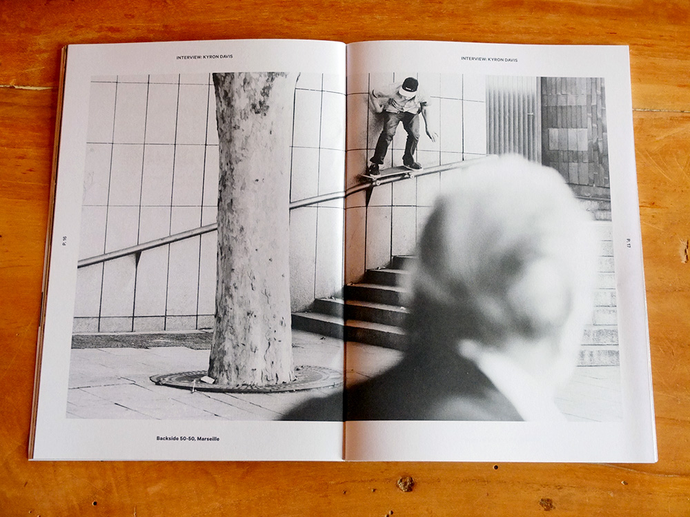
That last point is an important one - adverts will also persist, and for a company to advertise they need quality stills skateboard photography and it has to fit the patterns talked about above. Even with online only publications, and there are many, you will find a significant number of adverts using photos. The days of 250+ page issues of Transworld Skateboarding magazine may be over, but adverts are still key.
One Last Thing
I mentioned that skaters will travel large distances to skate spots, and the same applies to skateboard photographers. We are always on the hunt for new spots to skate and shoot. It’s part of the fun. It can also be interesting to visit spots you’re familiar with only through images to see how you might have been deceived by the original photographer. Is the shot true to life? How did they make it interesting? Could i have done better?
When i visited Alcatraz Island last year i wasn’t that impressed. An island overrun by tourists and full of derelict buildings, gift shops, and bird shit; sometimes all three at the same time. But really there was only one reason i visited and if you’re a skateboarder of a certain age, or a skateboard photographer who knows their history, you will understand.
-
Now month(s), this post has been sat in my drafts folder for a while… ↩
-
At one point i had monthly subscriptions to at least half a dozen skate magazines ↩
-
http://www.pocketwizard.com/inspirations/technology/hypersync_fpsync/. ↩
-
Well ok, i know of at least one example by Wig. ↩
-
No arguments here. Yes the photo is well executed. Yes it fits its purpose. Yes it sold. And yes, as a skateboarding photo it sucks. ↩
-
You can see some of my older shots on Achezine where i am less critical about the edit. ↩
-
Admittedly this probably had more to do with there being three publications in the UK at the time and Factory, who already were involved with two other skateboard magazines, taking over the magazine was the end of the line for Document. ↩